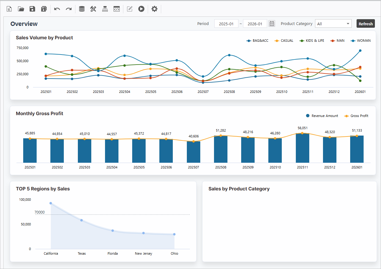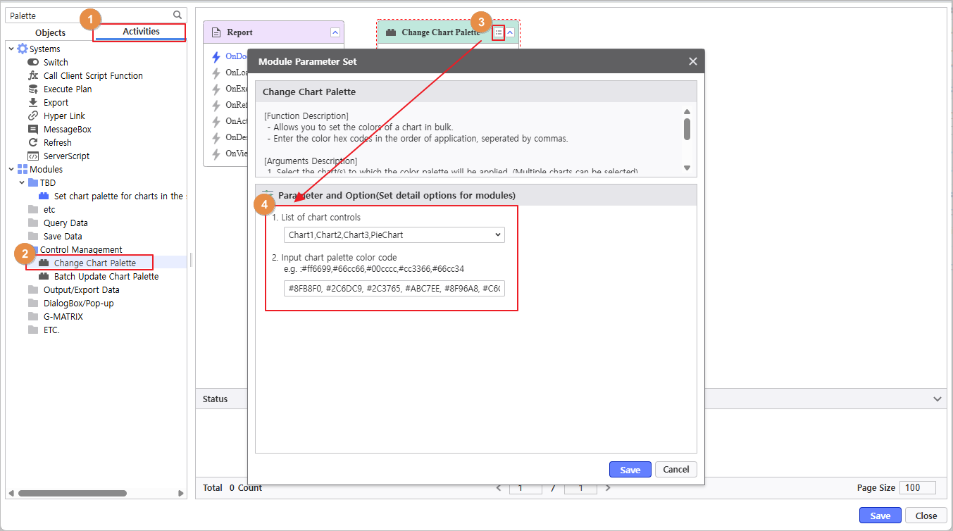
Target Screen |
|---|
|
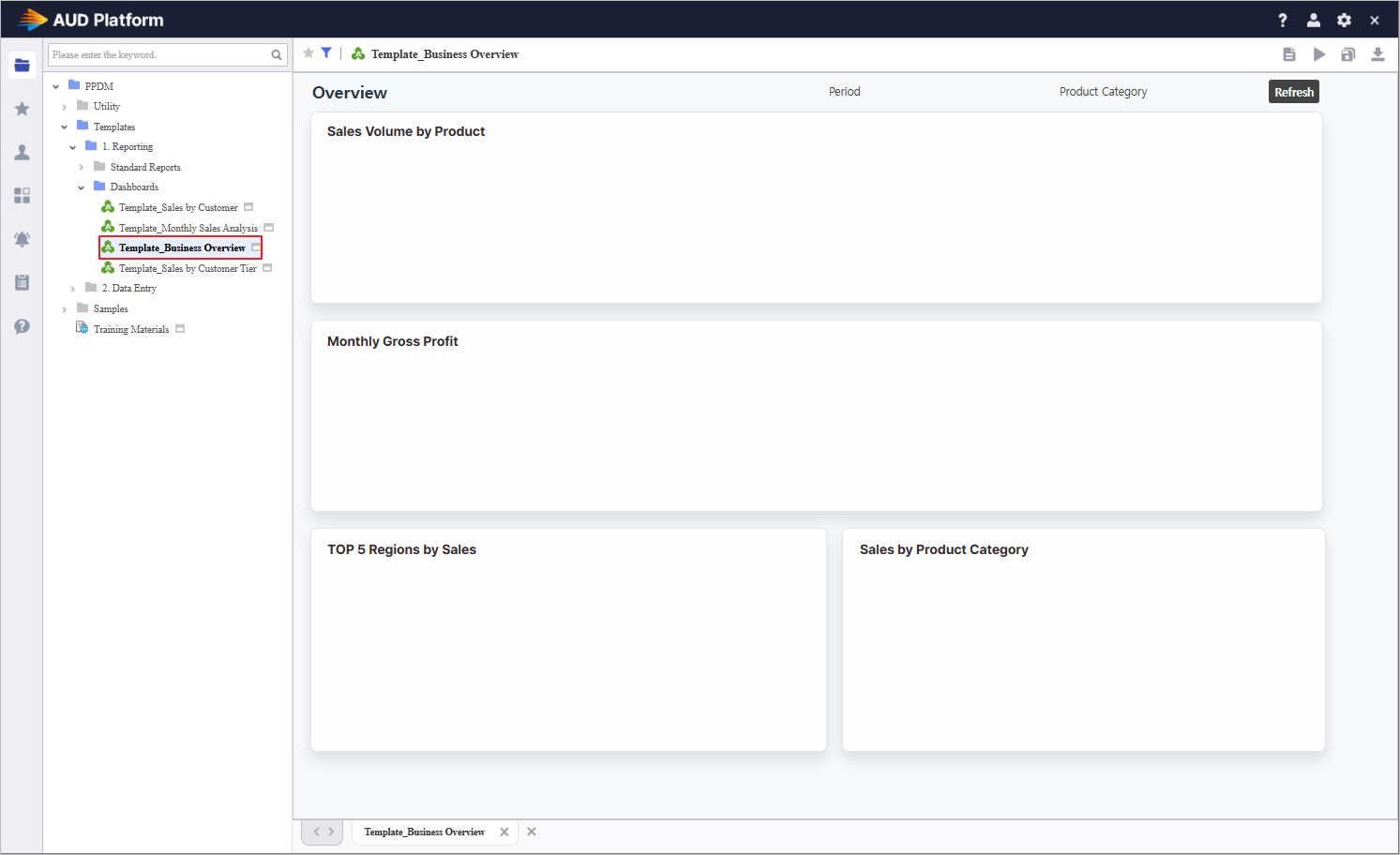
Download Practice Template To study the practice example above, use the following report by saving it with a new name. - How to Use the Business Overview Template
- Launch the report from the portal.
Template Path : PPDM > Templates > 1. Reporting > Dashboards > Template_Business Overview
- Click the Save As
 button in the top right to save it to your working folder. button in the top right to save it to your working folder.
- Run the saved report.
- Click the Edit Report
 button in the top right to launch the Designer window. button in the top right to launch the Designer window.
|
|
Step 1. Establish Inquiry Controls
Define the foundational inquiry components to drive dynamic data filtering.
1.1 Instantiate Components
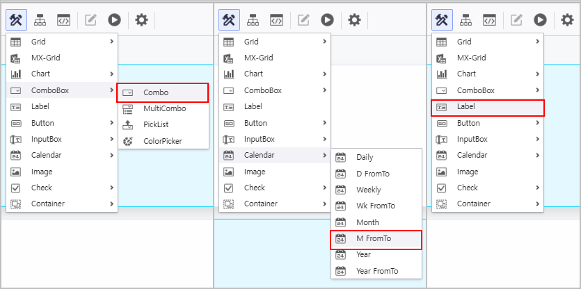
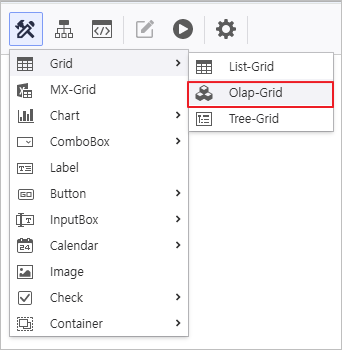
- Access the [UI Bot] menu to generate ComboBox, Calendar, and Label controls on the Designer.

1.2 Attribute Configuration
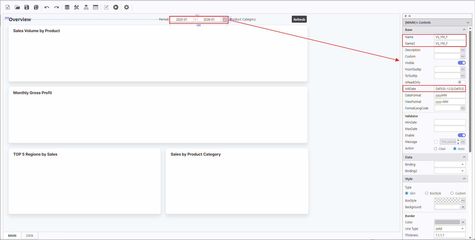
- In the Property Editor on the right, configure the Calendar attributes as follows:
- Name : VS_YM_F
- Name2 : VS_YM_T
- InitValue : DATE(0,-12,0);DATE(0,0,0)

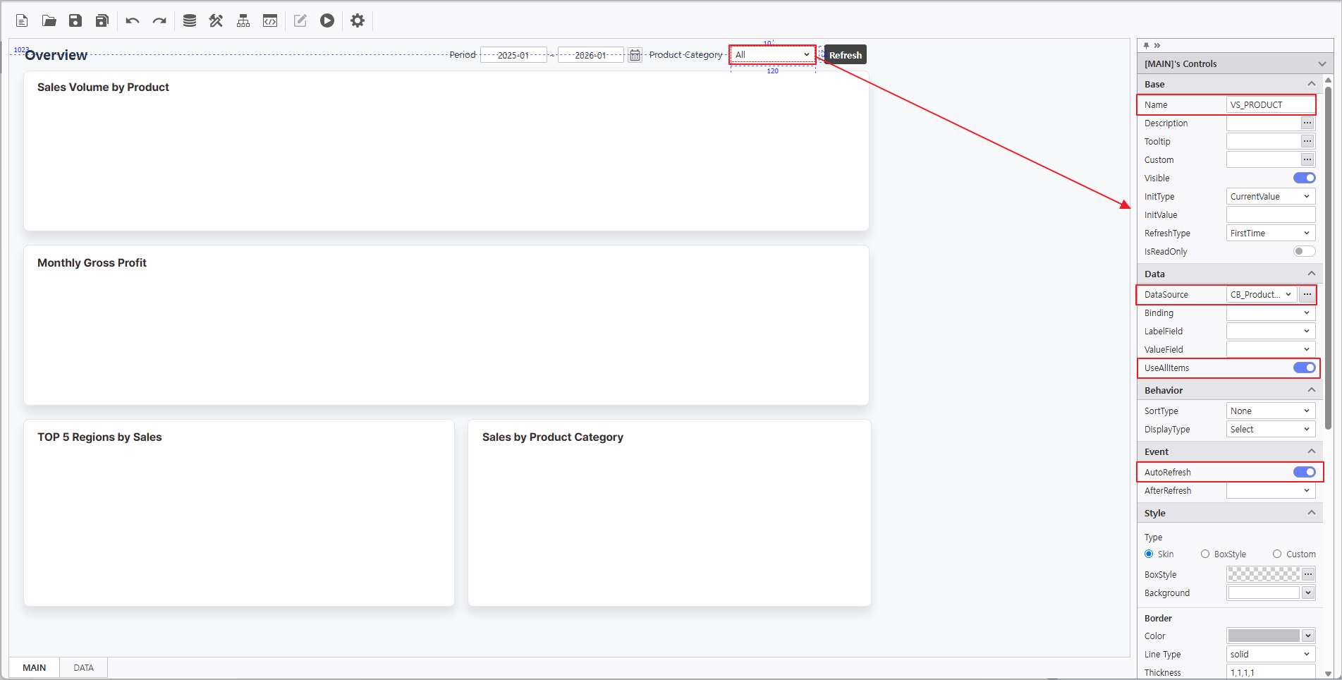
- In the Property Editor on the right, configure the ComboBox attributes as follows:
- Name : VS_PRODUCT
- DataSource : CB_ProductCategory
 More > SQL > "CB_ProductCategory"
 - Enable UseAllItems
- Enable AutoRefresh

In the Property Editor on the right, configure the Label attributes:
| Name | Text |
|---|
| LB_Period | Period |
| LB_ProductCategory | Product Category |
Step 2. Synchronize Chart and OlapGrid
Leverage chart attributes to link data from the OlapGrid.
2.1 OlapGrid Configuration
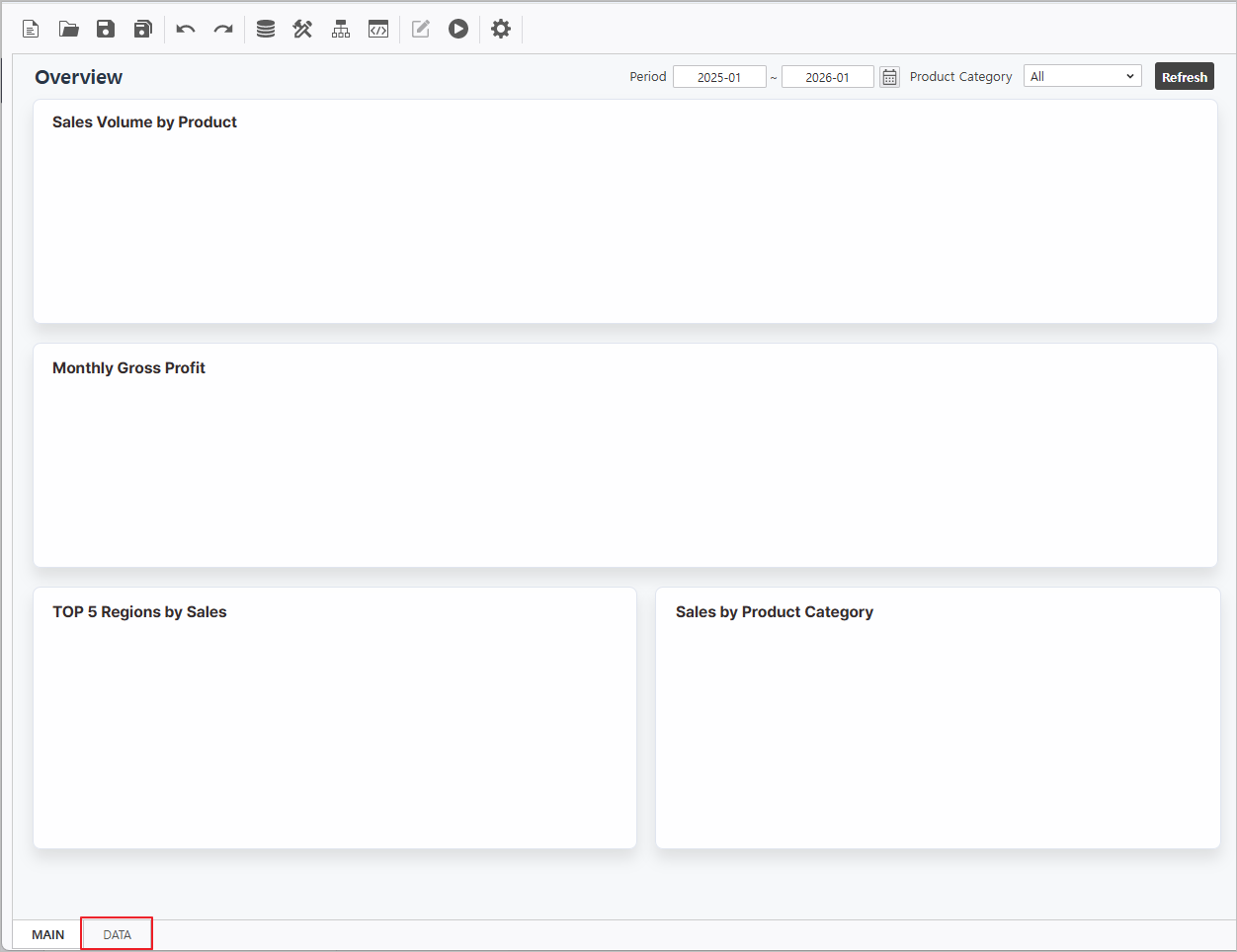
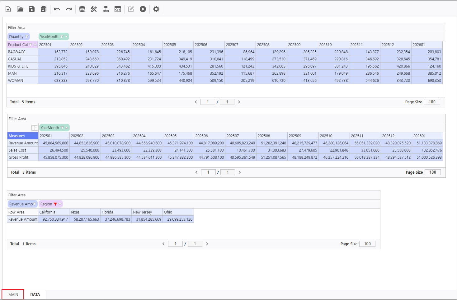
- Navigate to the DATA Form at the bottom of the report.

- Create an OlapGrid control.

Connect Data Source to OlapGrid & Enable AutoRefresh.
Right-click OlapGrid > DataSource > i-META > Select Sales Analysis META file ▪ Sales Analysis Path : Public Folder > PPDM > Samples > 3. i-META > Sales Analysis |
Select each OlapGrid and activate AutoRefresh in the properties pane on the right. 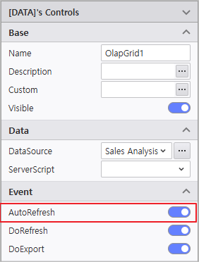
|
| Name | Query Items | Query Conditions | Operator | Variable Names |
|---|
| OlapGrid1 | - Column : [YearMonth]
- Row : [Product Category]
- Data : [Quantity]
| [YearMonth] | BETWEEN | :VS_YM_F ~ :VS_YM_T |
| [Product Category] | = | @:VS_PRODUCT |
| OlapGrid2 | - Column : [YearMonth]
- Data : [Revenue Amount, Sales Cost]
| [YearMonth] | BETWEEN | :VS_YM_F ~ :VS_YM_T |
| [Product Category] | = | @:VS_PRODUCT |
| OlapGrid3 | - Column : [Region]
- Data : [Revenue Amount]
| [YearMonth] | BETWEEN | :VS_YM_F ~ :VS_YM_T |
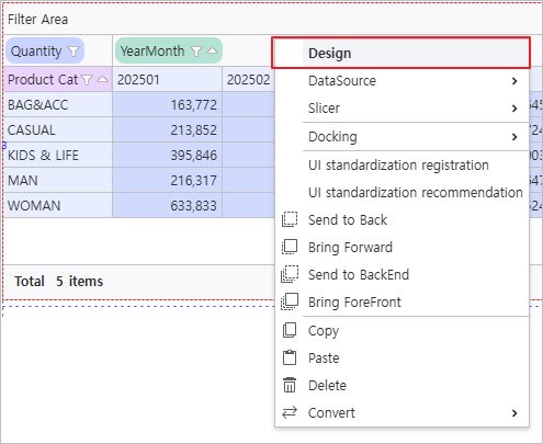
Right-click the OlapGrid to launch the Design menu and modify design attributes.

| Name | Field | Field > Calculated Field | Option > Auto Selection Area |
|---|
| OlapGrid1 | - | - | - Enable Auto Selection Area
- Range : Right 12, Bottom 4
|
| OlapGrid2 | - Change [Measures] Field Position :
Column > Row
| - Caption : Gross Profit
- Format : {0:N0}
- Formula : [Revenue Amount] - [Sales Cost]
| - Enable Auto Selection Area
- Range : Right 12, Bottom 2
|
| OlapGrid3 | - Change [Region] Field Attribute :
Click More  at Sort Attribute at Sort Attribute

| - | - Enable Auto Selection Area
- Range : Right 4
|
Navigate to Design > Field and click the Add  icon to generate calculated fields. icon to generate calculated fields. 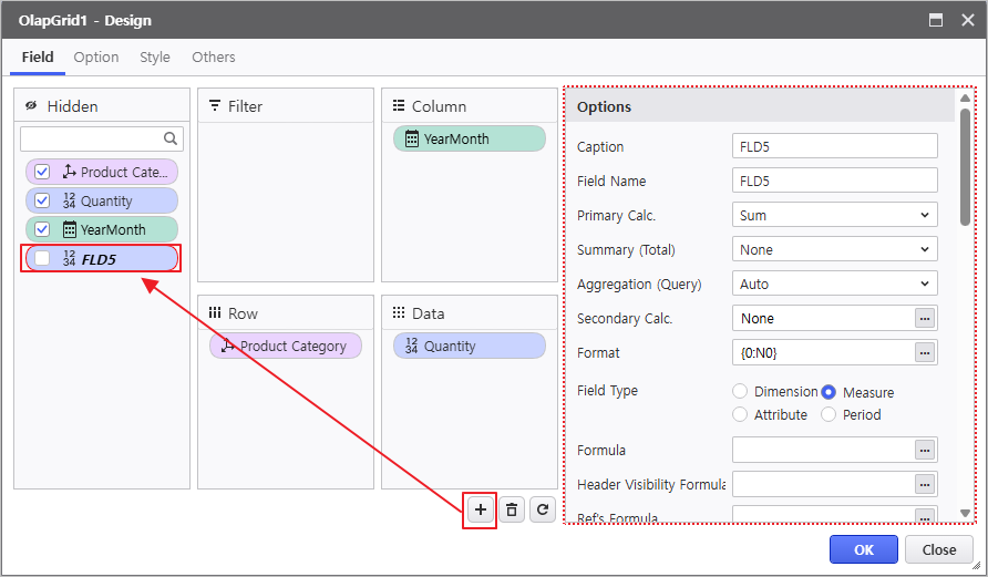
|
2.2 Chart Configuration
- Navigate to the MAIN Form at the bottom of the report.

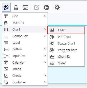
- Instantiate Chart controls within the MAIN Form.

Select each Chart control to update its Name in the property menu and link it to the OlapGrid created in the DATA form.
| Name | Data > OlapGrid |
|---|
| Chart1 | DATA.OlapGrid1 |
| Chart2 | DATA.OlapGrid2 |
| Chart3 | DATA.OlapGrid3 |
Select each Chart and designate the target Grid in the OlapGrid property field. 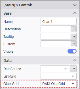
|
Click the Design menu to modify visual attributes.
| Name | Control Area | Basic > Chart Type | Series | Axis | Legend |
|---|
| Chart1 | Sales Volume by Product | Spline | - | - | - Position : Top, Right
- Direction : Horizontal
|
| Chart2 | Monthly Gross Profit | - | - Sales Cost : Deactivate Visible
- Gross Profit Chart Type : Spline
| - | |
| Chart3 | TOP5 Regions by Sales | Area Spline | - Style :
Background Color > Transparency > 0.1
Symbol Type > Circle
Symbol Color > #8fb8f0 - Others : Unit > 1000000(Million)
| - PlotLines :
Line Color > #2a3a47
Line Style > Dot
Line Width > 1
Display Criteria > 70000
Enable Criteria Visible
| |
Verify the report is functioning correctly.

Step 3. Create PieChart
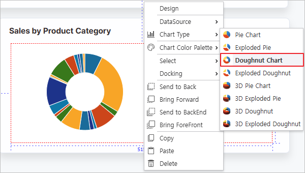
Develop a Doughnut Chart to visualize the current sales status by product category.
- Create a Pie-Chart control.

- Modify the control attributes
- Name : PieChart
- Enable AutoRefresh
Bind the data source using the Sales Analysis META file.
| Query Items | Query Conditions | Operator | Variable Names |
|---|
| [Product Subcategory, Revenue Amount] | [YearMonth] | BETWEEN | :VS_YM_F ~ :VS_YM_T |
| [Product Category] | = | @:VS_PRODUCT |
- Change Chart Type
- Chart Type : Doughnut Chart

Right-click the Pie-Chart to launch the Design window and modify visual attributes.
| Series | Legend |
|---|
- Label Field : [Product Subcategory]
- Value Field : [Revenue Amount]
- Format : {0:N0}
| - Position : Middle, Right
- Direction : Vertical
|
Verify the report is functioning correctly.

Step 4. Configure Process Bot
Orchestrate automated dashboard actions and styling using Process Bot.
4.1 Create Inquiry Button
Configure a button to view the report.
- Create a Button control

- Modify the control attributes.
- Name : BTN_RE
- Text : Refresh
- Style > BoxStyle : BTN1

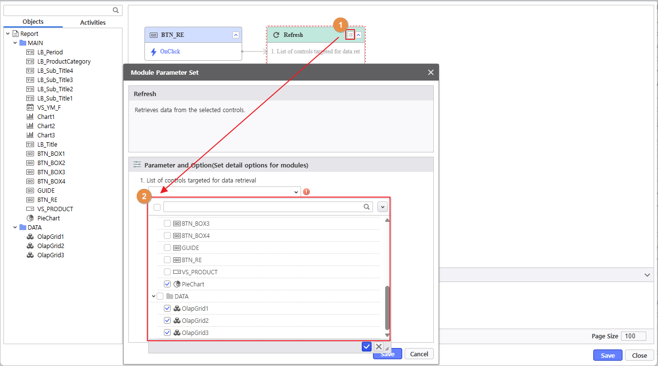
- Right-click the generated button and select Refresh from the Operation Settings menu.

- Click the Module Parameter icon (
 ) to configure the Refresh action.
Refresh Target : PieChart, OlapGrid1, OlapGrid2, OlapGrid3

4.2 Set Chart Colors
Set the chart colors using a module.
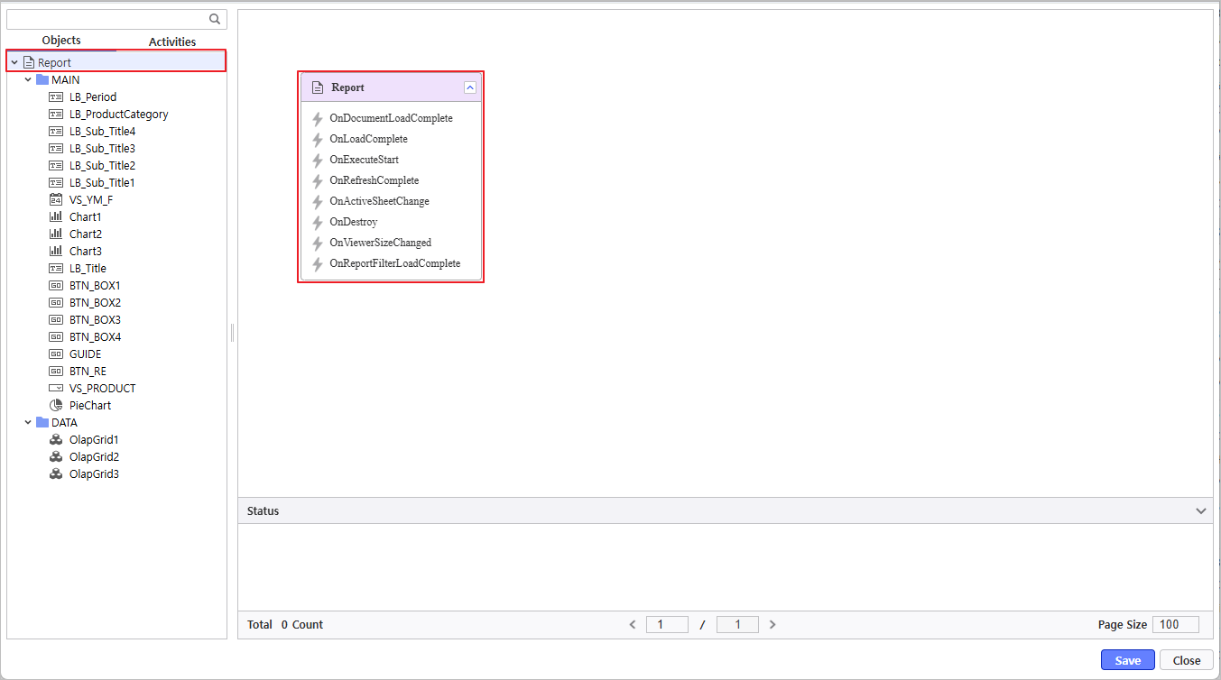
- Click the Process Bot icon (
 ) to launch the window and double-click the Report object.

- Navigate to Activities > Modules > Control Management > Change Chart Palette to select the module and set values.
- Chart Selection : PieChart, Chart1, Chart2, Chart3
- Enter Color Values
Once the parameter configuration is complete, link the 'Change Chart Palette' module to the OnDocumentLoadComplete event of the Report.

Used Color Codes #8FB8F0, #2C6DC9, #2C3765, #ABC7EE, #8F96A8, #C6CAD5, #C4D9F5, #EEF1F5 |
Verify the report is functioning correctly.

